
DAIgnosis: Exploring the Space of Metrics
Published:
Episode 1: Useful Metrics in Medical Diagnosis

One of the core tasks in building a machine learning model is to evaluate its performance. It’s fundamental, and it’s also really hard. While working on any project, especially in the context of healthcare, you should ask yourself: “How can I measure success for this project?” and “How would I know if and when I’ve succeeded?”. These questions allow you to set your goals in a realistic manner, so that you know when to stop. Sometimes they prevent you from working on ill-formulated projects where the concept of “good measurement” is vague or infeasible. It’s all a matter of traffic-lights. So how would one measure the green light: the success of a machine learning model? To answer this question, let’s take a sightseeing tour of machine learning model evaluation for disease diagnosis.
The most serious mistakes are not being made as a result of wrong answers. The truly dangerous thing is asking the wrong questions. Peter Drucker
It’s all about asking the right question: evaluation metrics are tied to machine learning tasks.
The problem of asking the right question is generally widespread in the Natural Sciences and it’s the very foundation of the scientific method paradigm, firstly introduced by Galileo Galilei.
Galilei was able to sketch an outline of a completely new framework: experiments as a research tool. Such a little contribution had exponential consequences in many fields, and this is where asking and mathematically formulating questions kicks in. In order to build a successful model, i.e. a satisfactory representation of some phenomenon, we need to find the best metric, the best measurement method.
Now we are ready to take the baton and rephrase the formulation of “asking the right question” in machine learning terms, i.e. how do we choose the best evaluation metric for our problem?
This question is of primary importance, since metrics are the only sensory contribute that we have with respect to generalization. In better words, metrics will tell us if our model has learned or not, and hence: if our model is overfitting or not.
What we are going to do now, is a showcase of different evaluation metrics in a specific setting: medical diagnosis. By doing that we hope to shed light on the usefulness of these tools while keeping some amount of concreteness in terms of a widely known use case. But first we’re going to introduce to you the dataset that we selected for today, namely the Chest X-ray 14 Dataset.
The Dataset
The Chest X-ray 14 Dataset has been released by the NIH Clinical Center and it’s made up by over 100’000 anonymized chest x-ray images, it’s considered a huge contribution to open science and machine learning research.
Regarding the data, there are 15 different* classes* corresponding to 14 different diseases and one class for “no findings”. For completeness we report the name of each class, since we are going to use them later: Atelectasis, Consolidation, Infiltration, Pneumothorax, Edema, Emphysema, Fibrosis, Effusion, Pneumonia, Pleural Thickening, Cardiomegaly, Nodule Mass and Hernia.
That’s all we need to know for our purposes, but if you are interested in further details you can refer to the NIH News release.
As far as we’ve seen, we are dealing with a multi-class classification *problem (i.e. the output is not *binary but categorical). Before starting with different metrics definitions, let’s take a quick peek at our dataset. For the sake of simplicity, we decided to sample the previously cited dataset and precompute model outputs for test cases, so you don’t have to worry about it. In this way you can find two different files train_preds.csv and valid_preds.csv (you can find every resource in our Github repository)
By using pandas we create two dataframes from our .csv files, correctly name class labels and define predicted labels which correspond to normalized probabilities with respect to a specific class, i.e. the output of the model.
#importing .csv files as pandas dataframes
train_results = pd.read_csv("train_preds.csv")
valid_results = pd.read_csv("valid_preds.csv")

# labels in our dataset
class_labels = ['Cardiomegaly',
'Emphysema',
'Effusion',
'Hernia',
'Infiltration',
'Mass',
'Nodule',
'Atelectasis',
'Pneumothorax',
'Pleural_Thickening',
'Pneumonia',
'Fibrosis',
'Edema',
'Consolidation']

# the labels for prediction values in our dataset
predicted_labels = [l + "_pred" for l in class_labels]

# extract the ground trouth (class_values) and the predictions (pred)
class_values = valid_results[class_labels].values
pred = valid_results[pred_labels].values
So far so good, we have our data correctly represented in pandas but let’s get an overview and check if there’s any class imbalance problem by plotting occurrences for each disease with matplotlib.
#Bar Chart
#For the sake of visual clarity --> sort bars in descending order
class_values = valid_results[class_labels].values #occurences
cnt_values = class_values.sum(axis = 0) #occurences x disease

df_to_plot = pd.DataFrame({"Disease": class_labels, "Count": cnt_values})
df_sorted = df_to_plot.sort_values("Count")


#Creating our plot as horizontal bar chart
plt.figure(figsize=(12,6))
plt.title('Disease Incidence', pad=10)
plt.xlabel("Number of Patients", size=15)
plt.barh("Disease", "Count", data = df_sorted, color=(240/255, 167/255, 95/255))
plt.grid(alpha = 0.3);
plt.tight_layout()
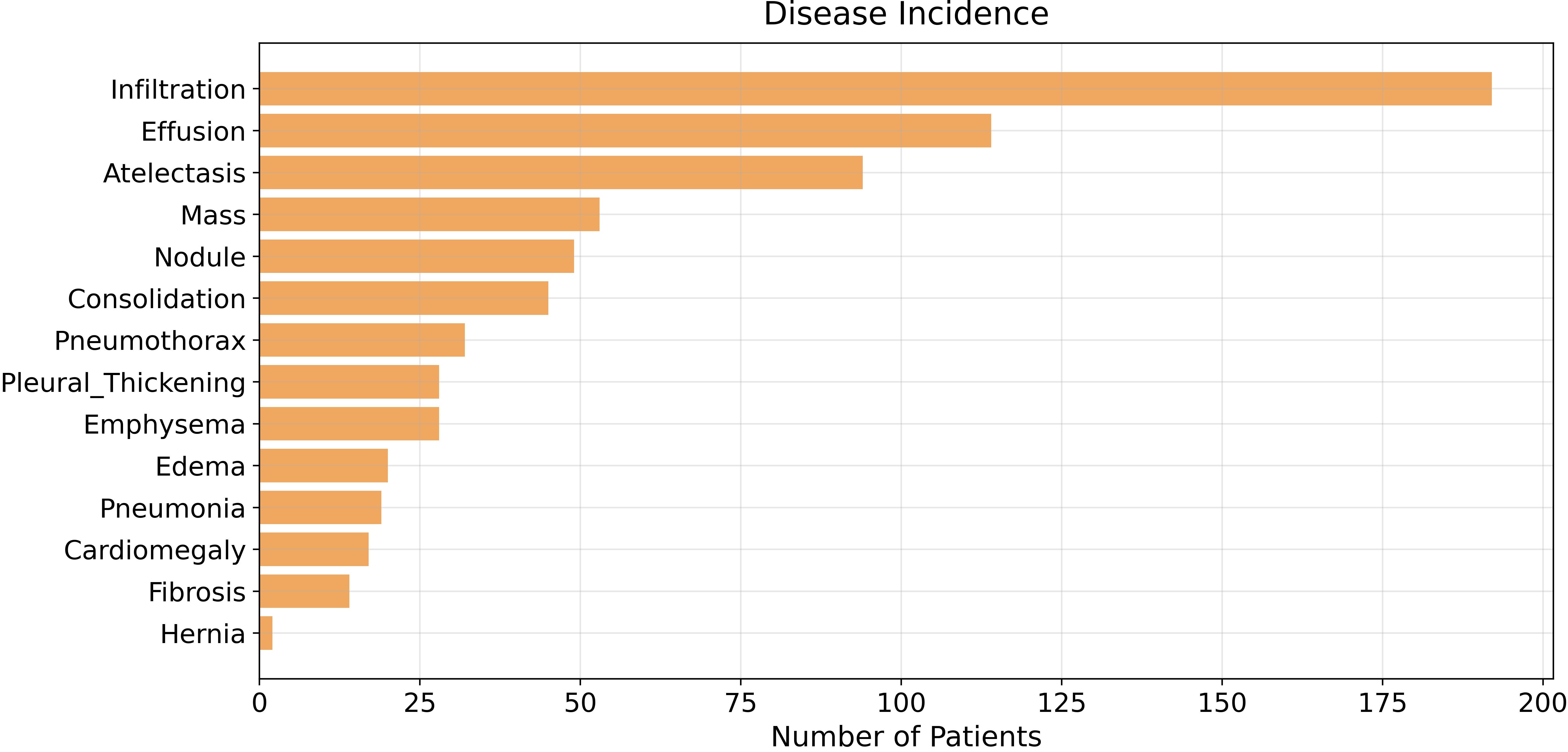
It’s pretty clear now: our dataset has an imbalanced population of samples, specifically, it has a small number of patients diagnosed with Hernia. The class imbalance problem affects almost every dataset, but today we’re not going to cope with it since it isn’t strictly correlated to evaluation metrics. Indeed, class imbalance is going to be one of the main topics of the next few articles, where we’re going to explore data augmentation in detail.
Basic Statistics
Everything starts from four basic statistics that we can compute from the model predictions: true positives (TP), true negatives (TN), false positives (FP) and false negatives (FN).
As the name suggests:
true positive: the model classifies the example as positive, and the actual label is also positive;
true negative: the model classifies the example as negative and the actual label is also negative;
false positive: the model classifies the example as positive, but the actual label is negative;
false negative: the model classifies the example as negative, but the actual label is positive.
These four are of unimaginable importance: every metrics can be built off of them.
Now a little technical rigidity: recall that the model outputs real numbers between 0 and 1, but as you can imagine the four statistics are binary by definition. Don’t you worry, we just need to define a threshold value th and any outputs above th will be set to 1, and below th to 0.
Here we define the four functions that return our beloved statistics.
#-------------- TRUE POSITIVES --------------#
def true_positives(y, pred, th=0.5):

TP = 0 #true positives
thresholded_preds = pred >= th # get thresholded predictions
TP = np.sum((y == 1) & (thresholded_preds == 1)) # compute TP
return TP

#-------------- TRUE NEGATIVES --------------#
def true_negatives(y, pred, th=0.5):

TN = 0 #true negatives
thresholded_preds = pred >= th # get thresholded predictions
TN = np.sum((y == 0) & (thresholded_preds == 0)) # compute TN
return TN

#-------------- FALSE POSITIVES --------------#
def false_positives(y, pred, th=0.5):

FP = 0 # false positives
thresholded_preds = pred >= th # get thresholded predictions
FP = np.sum((y == 0) & (thresholded_preds == 1)) # compute FP
return FP

#-------------- FALSE NEGATIVES --------------#
def false_negatives(y, pred, th=0.5):

FN = 0 # false negatives
thresholded_preds = pred >= th # get thresholded predictions
FN = np.sum((y == 1) & (thresholded_preds == 0)) # compute FN
return FN
Now let’s create a toy dataframe so we can see if everything works, if it’s the first time for you approaching these concepts you can try to manually fill the category column and double check the results.
df = pd.DataFrame({'y_test': [1,1,0,0,0,0,0,0,0,1,1,1,1,1],
'preds_test': [0.8,0.7,0.4,0.3,0.2,0.5,0.6,0.7,0.8,0.1,0.2,0.3,0.4,0],
'category': ['TP','TP','TN','TN','TN','FP','FP','FP','FP','FN','FN','FN','FN','FN']
})

df # Show data
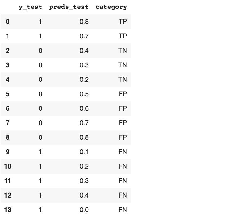
We can compare predicted results with the ground truth.
# take a look at predictions and ground truth
y_test = df['y_test']
preds_test = df['preds_test']
threshold = 0.5

print(f"""Predicted results:
TP: {true_positives(y_test, preds_test, threshold)}
TN: {true_negatives(y_test, preds_test, threshold)}
FP: {false_positives(y_test, preds_test, threshold)}
FN: {false_negatives(y_test, preds_test, threshold)}
""")

print("Expected results:")
print(f"TP: {sum(df['category'] == 'TP')}")
print(f"TN {sum(df['category'] == 'TN')}")
print(f"FP {sum(df['category'] == 'FP')}")
print(f"FN {sum(df['category'] == 'FN')}")
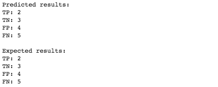
We get the same results, our model can be considered “qualitatively good”, but how do we quantify how good is our model?
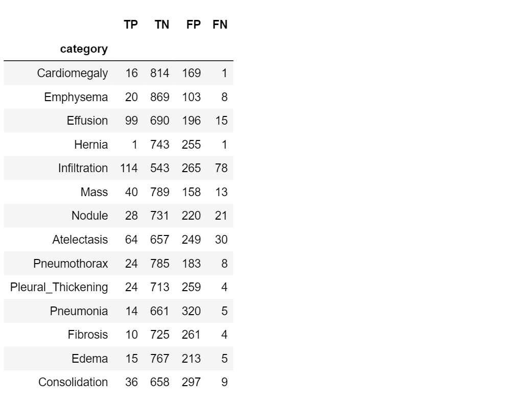
Now it’s time to take a look at our dataset: let’s compute TP, TN, FP, FN for our cases.
#TP computation
TP=[]
for i in range(len(class_labels)):
    TP.append(true_positives(class_values[:,i], pred[:,i], 0.5))
#TN computation
TN=[]
for i in range(len(class_labels)):
    TN.append(true_negatives(class_values[:,i], pred[:,i], 0.5))

#FP computation
FP=[]
for i in range(len(class_labels)):
    FP.append(false_positives(class_values[:,i], pred[:,i], 0.5))

#FN computation
FN=[]
for i in range(len(class_labels)):
    FN.append(false_negatives(class_values[:,i], pred[:,i], 0.5))
#create a results table
table=pd.DataFrame({'category' : class_labels,
'TP': TP,
'TN': TN,
'FP': FP,
'FN': FN,
})
table.set_index('category')
The first brick: Accuracy
Let’s start introducing the first metric that allows us to measure a model performance in a simple and intuitive way: diagnostic accuracy.
Accuracy answer to the question “how good is our model?” by only measuring how often our classification model makes the correct prediction:
![]()
In a probabilistic way, we can interpret the accuracy as the probability of being correct: in terms of TP, TN, FN and FP, accuracy defines the proportion of true positive and true negative individuals in a total group of subjects. Then,

Now let’s work with our dataset: we will illustrate how to compute accuracy and then we’ll test it in the whole dataset.
def get_accuracy(y, pred, th=0.5):

accuracy = 0.0
TP = true_positives(y, pred, th = th)
FP = false_positives(y, pred, th = th)
TN = true_negatives(y, pred, th = th)
FN = false_negatives(y, pred, th = th)
accuracy = (TP + TN)/(TP + TN + FP + FN)  # Accuracy computation return accuracy

# Compute accuracy for the dataset classes
acc=[]
for i in range(len(class_labels)):
    acc.append(get_accuracy(class_values[:,i], pred[:,i], 0.5))
#create a results table
table2=pd.DataFrame({'category' : class_labels,
'accuracy': acc
})
table2.set_index('category')
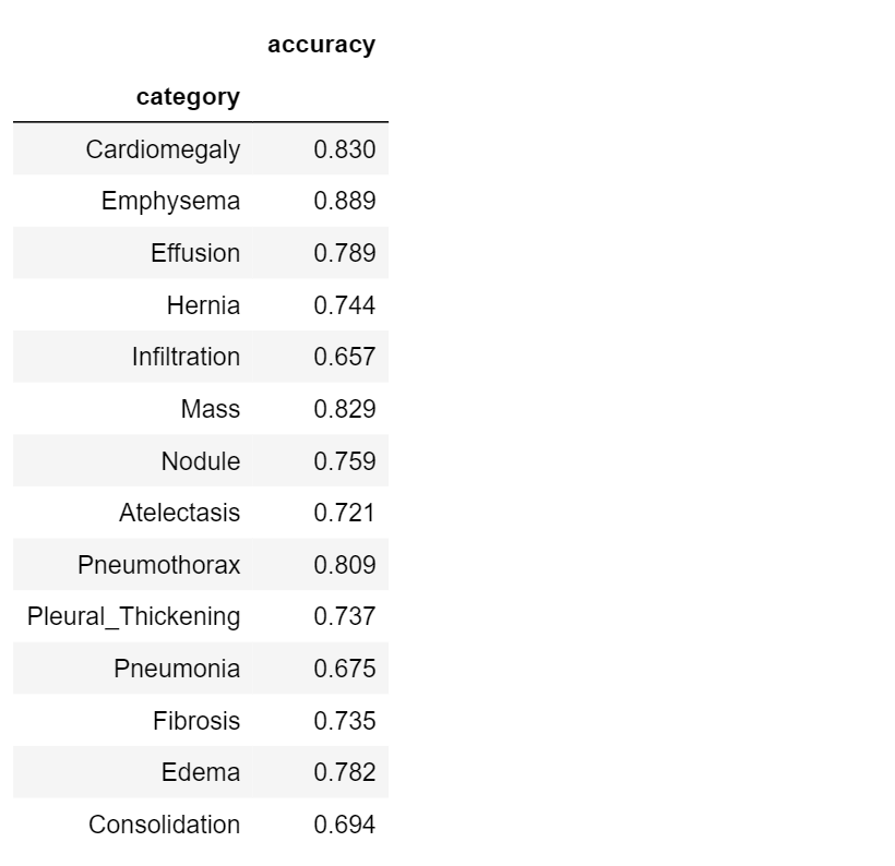
What would we say about the performance of our model? Is it good or not?
If we consider Pneumonia detection (accuracy = 0.675), the model is certainly not accurate. Take a look at Emphysema detection, instead (accuracy = 0.889): it is a little more precise! So we can say that our classification model is better in detecting* Emphysema* than* Pneumonia*.
What happens if we consider a different model, able to predict if the subject does not have Emphysema disease (i.e. the new model is a simple binary classifier)?
Compute the accuracy for this simple model:
print('Emphysema disease accuracy =', get_accuracy(valid_results["Emphysema"].values, np.zeros(len(valid_results))))

It is a great result! This model is clearly better than the first one.
Let’s stop for a moment and consider the results we have just obtained. The first model discriminates between different kinds of disease; the second one classifies the presence or absence of a certain disease, and it performs significantly better. This gives us a starting point to define more specific evaluation metrics: in order to get more performant results, it is necessary to consider diagnostic metrics that evaluate how well the model predicts positives for patients with a certain disease, and negatives for healthy subjects.
Prevalence
With prevalence we can focus on the presence of a certain disease: it is, by definition, the probability to have a certain disease.
This metric relates to the proportion of individuals with disease in a total of subjects (healthy + diseased) and it is easily defined as the ratio between positive examples and the size of the sample:

where yᵢ=1 for positive examples.
Let’s define and compute prevalence for each disease in our dataset:
def get_prevalence(y):

prevalence = 0.0
prevalence = np.sum(y)/len(y) #Prevalence computation
return prevalence

# Compute accuracy for the dataset classes
prev=[]
for i in range(len(class_labels)):
    prev.append(get_prevalence(class_values[:,i]))
#create a results table
table3=pd.DataFrame({'category' : class_labels,
'prevalence': prev
})
table3.set_index('category')
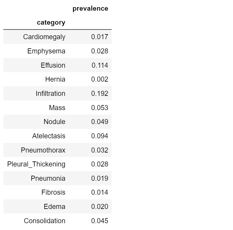
High scores indicate common diseases (e.g. Infiltration, 0.192); low scores indicate rare diseases (e.g. Hernia, 0.002)
Sensitivity and Specificity
Sensitivity and specificity are two complementary metrics, a little bit more precise than accuracy, but related with it.
Sensitivity is the probability that the model predicts positive if the patient have the disease: it is the proportion of examples classified as positive in a total of positive examples.

Specificity is the probability that the model predicts negative for a subject without the disease: it is the proportion of examples classified as negative in a total of negative cases.

| In terms of probability, sensitivity and specificity relate to the following conditional probabilities P(+ | disease) and** P**(- | normal) (i.e. the probability that the model outputs positive, given a disease-subject, and the probability that the model outputs negative, given a healt subject). |
Now let’s see how to compute this metrics and how they work on our dataset:
#------SENSITIVITY------#

def get_sensitivity(y, pred, th=0.5):

sensitivity = 0.0
TP = true_positives(y, pred, th = th)
FN = false_negatives(y, pred, th = th)
sensitivity = TP/(TP + FN)
return sensitivity

#------SPECIFICITY------#

def get_specificity(y, pred, th=0.5):

specificity = 0.0
TN = true_negatives(y, pred, th = th)
FP = false_positives(y, pred, th = th)
specificity = TN/(TN + FP)
return specificity

# Compute accuracy for the dataset classes
sens=[]
spec=[]
for i in range(len(class_labels)):
    sens.append(get_sensitivity(class_values[:,i], pred[:,i], 0.5))
    spec.append(get_specificity(class_values[:,i], pred[:,i], 0.5))

#create a results table
table4=pd.DataFrame({'category' : class_labels,
'sensitivity': sens,
'specificity': spec
})
table4.set_index('category')
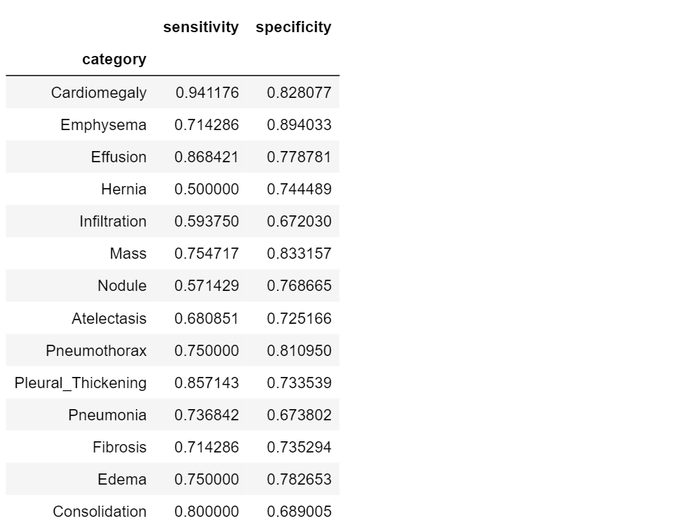
Specificity and sensitivity do not depend on the prevalence of the positive class in the dataset, but they don’t really tell us anything new. Sensitivity, for example, is the probability that our model outputs positive given that the person already has the condition!
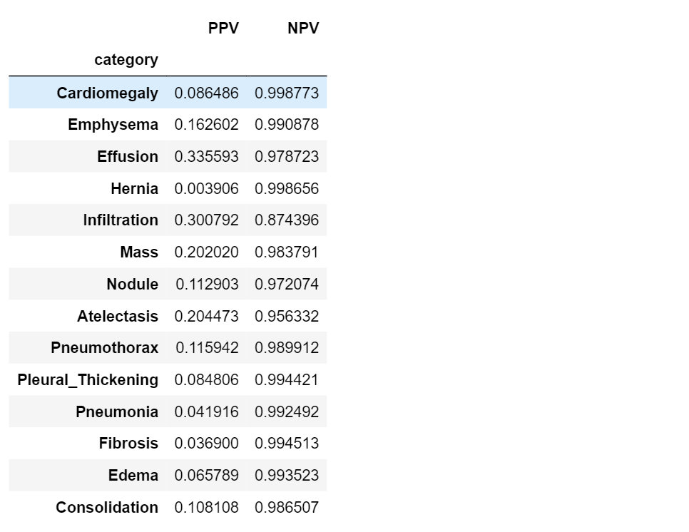
PPV and NPV
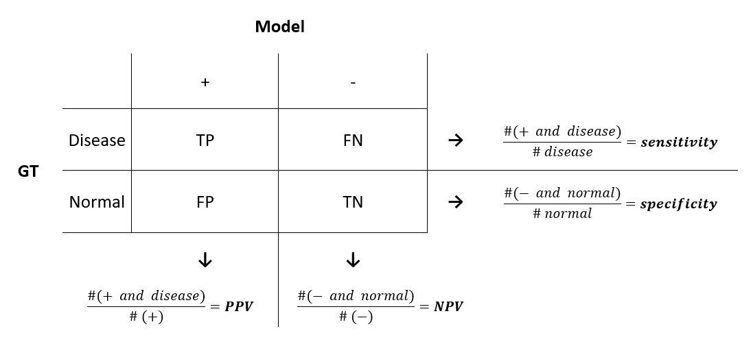
As we’ve just seen, sensitivity and specificity are not diagnostically helpful. In the clinic, a doctor using some model might be interested in a different approach: given the model predicts positive on a patient, what is the probability that he actually has the disease? This is called the positive predictive value (PPV) of a model. Similarly, the doctor might want to know the probability that a patient is normal, given the model prediction is negative. This is called the negative predictive value (NPV) of a model.
To get an overall view of the metrics, let’s introduce the confusion matrix, which shows the comparison between the ground truth (the actual data) and what is obtained through the model.
In the same way as we did before, let’s see how we can compute PPV and NPV using our data.
#------ PPV ------#

def get_ppv(y, pred, th=0.5):

    PPV = 0.0

  # get TP and FP using our previously defined functions
    TP = true_positives(y, pred, th = th)
    FP = false_positives(y, pred, th = th)
  # use TP and FP to compute PPV
    PPV = TP/(TP + FP)

    return PPV

#------ NPV ------#

def get_npv(y, pred, th=0.5):

    NPV = 0.0

  # get TN and FN using our previously defined functions
    TN = true_negatives(y, pred, th = th)
    FN = false_negatives(y, pred, th = th)
  # use TN and FN to compute NPV
    NPV = TN/(TN + FN)

    return NPV

# Compute PPV and NPV for the dataset classes
PPV=[]
NPV=[]
for i in range(len(class_labels)):
    PPV.append(get_ppv(class_values[:,i], pred[:,i], 0.5))
    NPV.append(get_npv(class_values[:,i], pred[:,i], 0.5))

#create a results table
table5=pd.DataFrame({'category' : class_labels,
'PPV': PPV,
'NPV': NPV
})
table5.set_index('category')
Receiver Operating Characteristic (ROC) curve
So far we have been operating under the assumption that our model had a prediction threshold of 0.5. But what happens if we change it? How this change affects the efficiency of our model?
A Receiver Operating Characteristic (ROC) curve is a plot that shows us the performance of our model as its prediction threshold is varied. To construct a ROC curve, we plot the true positive rate (TPR) againts the false positive rate (FPR), at various threshold settings.
from sklearn.metrics import roc_curve, roc_auc_score

def get_ROC(y, pred, target_names):
    for i in range(len(target_names)):
      curve_function = roc_curve
      auc_roc = roc_auc_score(y[:, i], pred[:, i])
      label = target_names[i] + " AUC: %.3f " % auc_roc
      xlabel = "False positive rate"
      ylabel = "True positive rate"
      a, b, _ = curve_function(y[:, i], pred[:, i])
      plt.figure(1, figsize=(7, 7))
      plt.plot([0, 1], [0, 1], 'k--')
      plt.plot(a, b, label=label)
      plt.xlabel(xlabel)
      plt.ylabel(ylabel)
      plt.legend(loc='upper center', bbox_to_anchor=(1.3, 1),
                       fancybox=True, ncol=1)

#plot the curve
get_ROC(class_values, pred, class_labels)
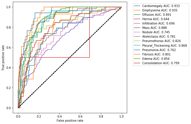
The shape of a ROC curve, and the area under it (Area Under the Curve AUC), tell us how performant is our model: a good model is represented by a ROC curve closed to the upper left hand corner (where TPR is approximately 1 and FPR is 0) and by a AUC value of 1; a bad model has a ROC curve that tends to the diagonal and the respective AUC value is about 0.5.
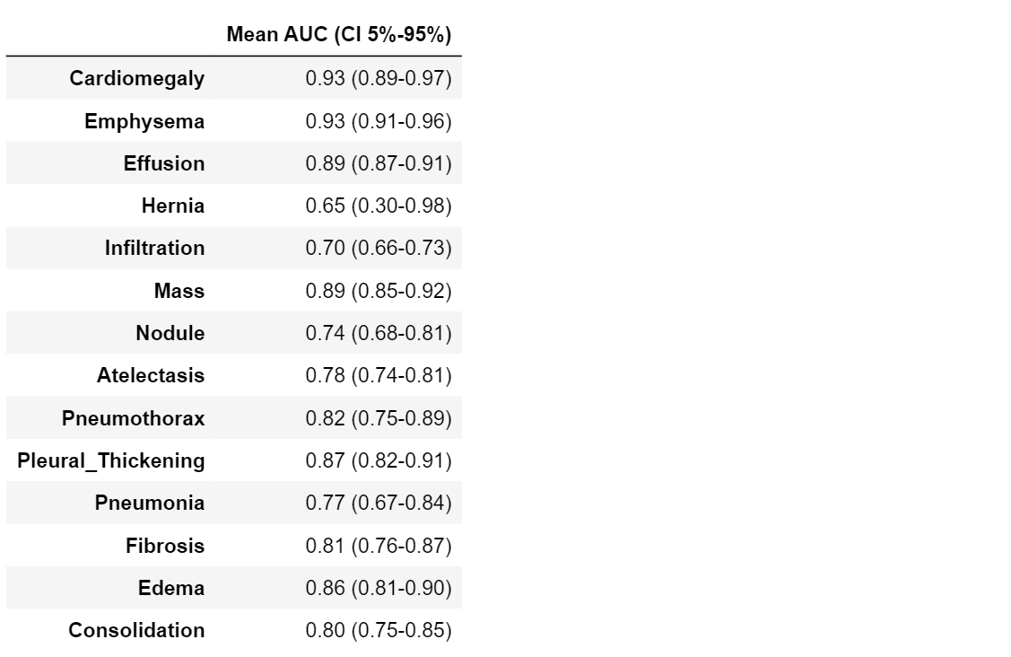
Confidence Intervals
Our dataset is only a sample of the real world, and our calculated values for all the above metrics are an estimate of real world values. Hence, it would be better to quantify this uncertainty due to the sampling of our dataset. We’ll do this through the use of confidence intervals. A 95% confidence interval for an estimate** 𝑠̂** of a parameter 𝑠 is an interval 𝐼=(𝑎,𝑏) such that 95% of the time, when the experiment is run, the true value 𝑠 is contained in 𝐼. More concretely, if we were to run the experiment many times, then the fraction of those experiments for which 𝐼 contains the true parameter would tend towards 95%. Thus, 95% confidence does not say that there is a 95% probability that s lies within the interval. It also does not say that 95% of the sample accuracies lie within this interval.
While some estimates come with methods for computing the confidence interval analytically, more complicated statistics, such as the AUC for example, are difficult. In these cases, we can use a method called bootstrap. The bootstrap estimates the uncertainty by resampling the dataset with replacement. For each resampling 𝑖, we will get a new estimate, 𝑠̂(i). We can then estimate the distribution of 𝑠̂ by using the distribution of 𝑠̂(i) for our bootstrap samples.
In the code below, we create bootstrap samples and compute sample AUCs from those samples. Note that we use stratified random sampling (sampling from positive and negative classes separately) to make sure that members of each class are represented.
#------ computing intervals -------#

def bootstrap_auc(y, pred, classes, bootstraps = 100, fold_size = 1000):
    statistics = np.zeros((len(classes), bootstraps))

    for c in range(len(classes)):
        df = pd.DataFrame(columns=['y', 'pred'])
        df.loc[:, 'y'] = y[:, c]
        df.loc[:, 'pred'] = pred[:, c]
        # get positive examples for stratified sampling
        df_pos = df[df.y == 1]
        df_neg = df[df.y == 0]
        prevalence = len(df_pos) / len(df)

        for i in range(bootstraps):
            pos_sample = df_pos.sample(n = int(fold_size * prevalence), replace=True)
            neg_sample = df_neg.sample(n = int(fold_size * (1-prevalence)), replace=True)
            y_sample = np.concatenate([pos_sample.y.values, neg_sample.y.values])
            pred_sample = np.concatenate([pos_sample.pred.values, neg_sample.pred.values])
            score = roc_auc_score(y_sample, pred_sample)
            statistics[c][i] = score
    return statistics

statistics = bootstrap_auc(class_values, pred, class_labels)

#------ printing table ------#

table7 = pd.DataFrame(columns=["Mean AUC (CI 5%-95%)"])
for i in range(len(class_labels)):
    mean = statistics.mean(axis=1)[i]
    max_ = np.quantile(statistics, .95, axis=1)[i]
    min_ = np.quantile(statistics, .05, axis=1)[i]
    table7.loc[class_labels[i]] = ["%.2f (%.2f-%.2f)" % (mean, min_, max_)]
Precision-Recall Curve
Precision and recall are two metrics often used together:
Precision is a measure of result relevancy: it quantify the ability of our model to not label a negative subject as positive. The precision score is equivalent to PPV
Recall is a measure of how many truly relevant results are returned: it is the probability that a positive prediction is actually positive. The recall score is equivalent to sensitivity
The precision-recall curve (PRC) illustrate the relationship between precision and recall for different thresholds. Let’s compute it:
#----- PRC -----#
from sklearn.metrics import average_precision_score, precision_recall_curve

def get_PRC(y, pred, target_names):
    for i in range(len(target_names)):
            precision, recall, _ = precision_recall_curve(y[:, i], pred[:, i])
            average_precision = average_precision_score(y[:, i], pred[:, i])
            label = target_names[i] + " Avg.: %.3f " % average_precision
            plt.figure(1, figsize=(7, 7))
            plt.step(recall, precision, where='post', label=label)
            plt.xlabel('Recall')
            plt.ylabel('Precision')
            plt.ylim([0.0, 1.05])
            plt.xlim([0.0, 1.0])
            plt.legend(loc='upper center', bbox_to_anchor=(1.3, 1),
                       fancybox=True, ncol=1)

#----- plot the curve -----#
get_PRC(class_values, pred, class_labels)
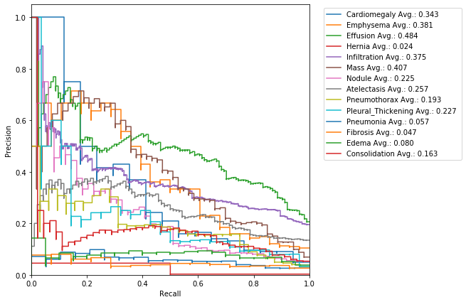
The area under the curve helps us to estimate once again how good is our model: high area is due to high recall and high precision, i.e. low false positive rate and low false negative rate, and therefore it represents a good performance.
F1-Score
F1-score combines precision and recall trough their armonic mean:

#----- F1-score -----#
def get_f1(y, pred, th=0.5):

    F1 = 0.0

    # get precision and recall using our previously defined functions

    precision=get_ppv(y, pred, th = th)
    recall=get_sensitivity(y, pred, th = th)

# use precision and recall to compute F1
    F1 = 2 * (precision * recall) / (precision + recall)


    return F1
Alternatively, we can simply use sklearn’s utility metric function of f1_score to compute this measure:
from sklearn.metrics import f1_score
Now, let’s compute F1 score for the classes in our dataset:
f1=[]
for i in range(len(class_labels)):
 f1.append(get_f1(class_values[:,i], pred[:,i]))

#create a results table
table8=pd.DataFrame({‘category’ : class_labels,
‘F1’: f1
})
table8.set_index(‘category’)
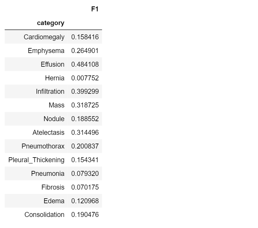
F1-score lies in the range [0.1]: a perfect diagnostic model has a F1-score 1.
Be careful on overusing the F1-score though, in practice, different types of misclassifications incur different costs. David Hand and many others criticize the widespread since it gives equal importance to precision and recall.
Conclusion
At this point, as the icing on the cake, you can take a look at the final table, which compares results from every metric.
table9=pd.DataFrame({'category' : class_labels,
'TP': TP,
'TN': TN,
'FP': FP,
'FN': FN,
'accuracy': acc,
'prevalence': prev,
'sensitivity': sens,
'specificity': spec,
'PPV': ppv,
'NPV': npv,
'AUC': auc_value,
'Mean AUC (CI 5%-95%)' :table7['Mean AUC (CI 5%-95%)'],
'F1': f1
})
table9.set_index('category')
In this article, we have discussed about evaluation metrics that are useful in diagnostic. By running the code throughout each section you should get a more practical sense of each of these metrics. You should be careful in choosing the best metric for some specific problem, in this sense, we hope to have shed light in such a difficult task.
This is the first episode of a series devoted to the applications of AI in Medical Diagnosis, the story has just begun. In the next one, we’re going to show you how to deal with a dataset and what is Exploratory Data Analysis (EDA). Since we’re going to deal with x-rays images, it will be necessary to introduce a particular kind of neural network, namely the Convolutional Neural Network (CNN) architecture.
Take a look at the full implementation of our code here on Github (and star us if you like our project!)
References:
Measures of diagnostic accuracy: basic definitions, A. M. Simundic
Turi Machine Learning Platform User Guide, Classification metrics
Evaluating Machine Learning Models, A. Zheng, O’Reilly Media Inc.
AI for Medical Diagnosis, by deeplearning.ai, Coursera, Andrew NG

